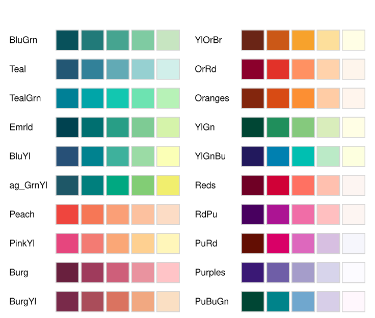
R packages to get color palettes.
stoptags: general
star10
(full meta data to go here)
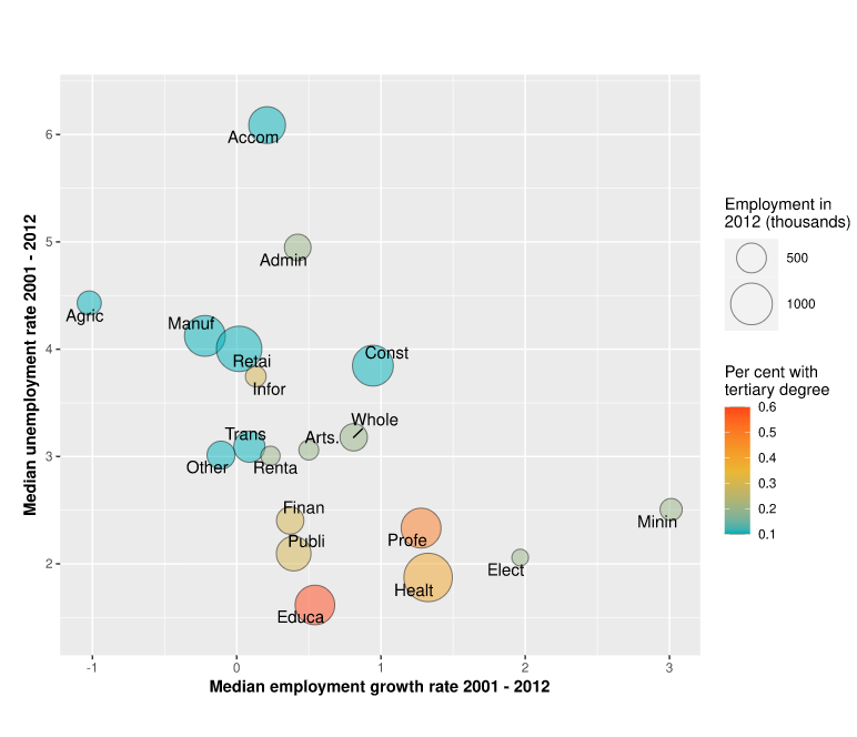
Use bubble size and color to display additional data attributes.
stoptags: bubble
star100
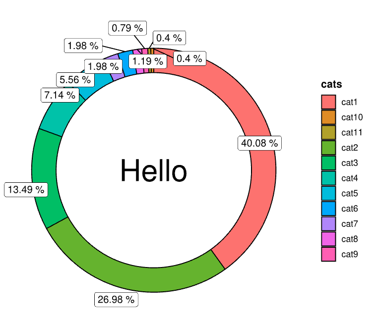
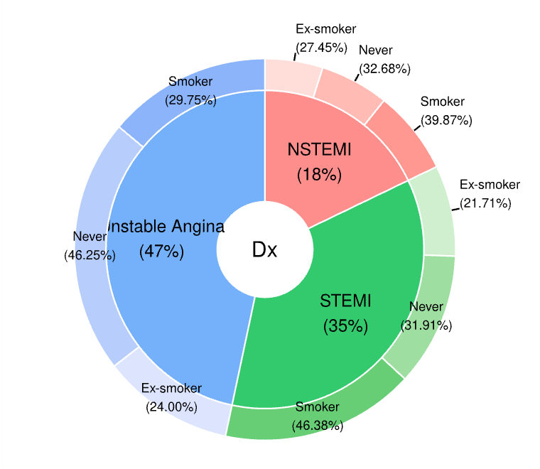
A special pie chart with label in the center.
stoptags: pie
star99
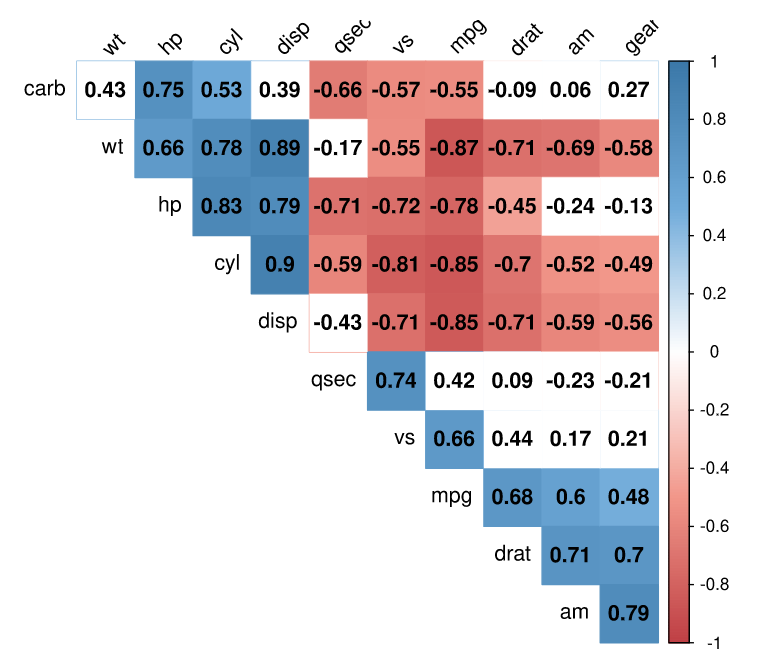
Calculates the correlation matrix between each row
stoptags: correlation,heatmap
star98
Provides a coherent set of functions centered on data exploration and simple reporting.
stoptags: exploratory,stats
star102
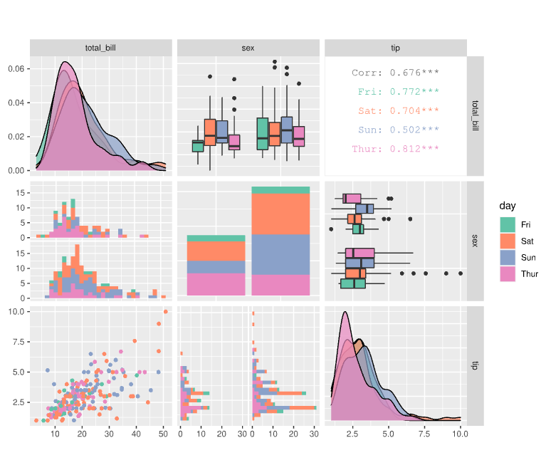
stoptags: exploratory,correlation
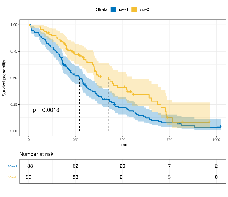
Computes an estimate of a survival curve for censored data using either the Kaplan-Meier or the Fleming-Harrington method.
stoptags: survival,stats
Multipe levels of pie charts
star80
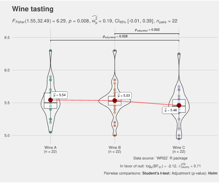
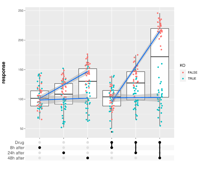
Within group/condition comparisons.
stoptags: violin,stats
star200
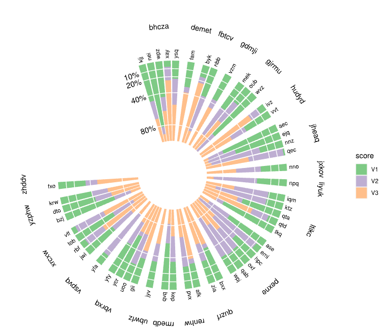
Polar histograms can be very useful for plotting stacked bar graph with multiple entries.
stoptags: polar,histogram
star201
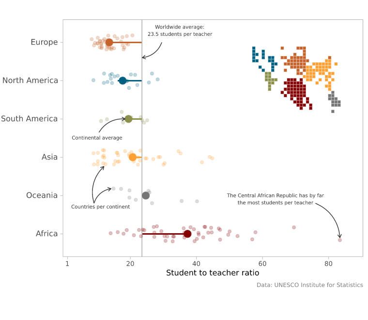
Student vs. teacher ratio
stoptags: demo
star20
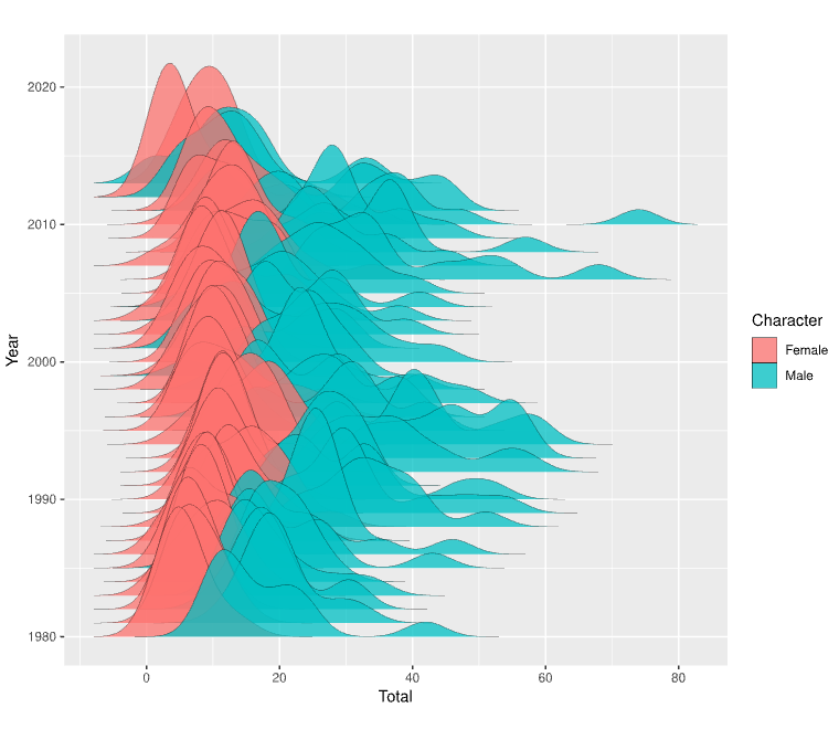
Comparison of two distributions along the third axis (e.g. time, regions)
stoptags: distribution,histogram
star180
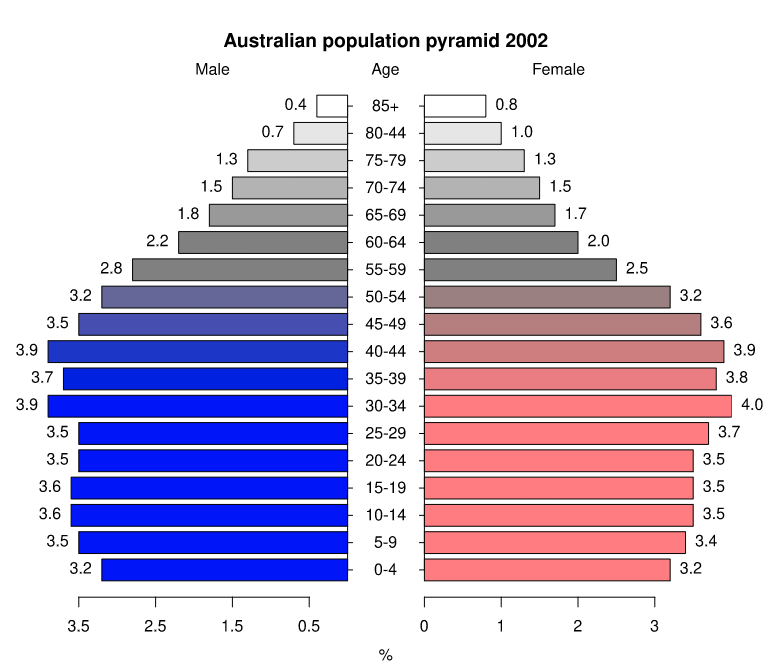
Displays a pyramid (opposed horizontal bar) plot
stoptags: distribution,bar
star40
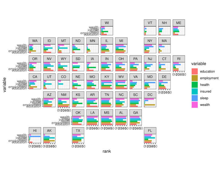
Flexibly visualize data for different geographical regions by providing a ggplot2 faceting function
stoptags: geograph,bar
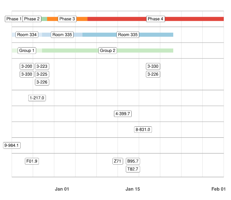
Time-based charts, like Gantt or timelines
stoptags: Gantt,timeline
star186
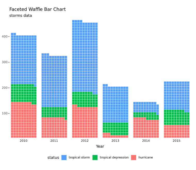
Square pie charts (waffle charts) can be used to communicate parts of a whole for categorical quantities
stoptags: bar,waffle
star88
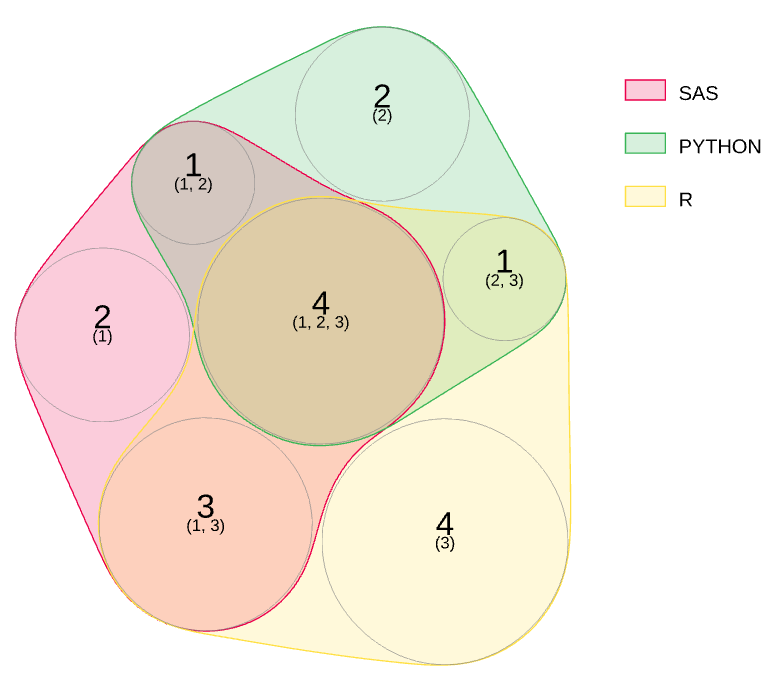
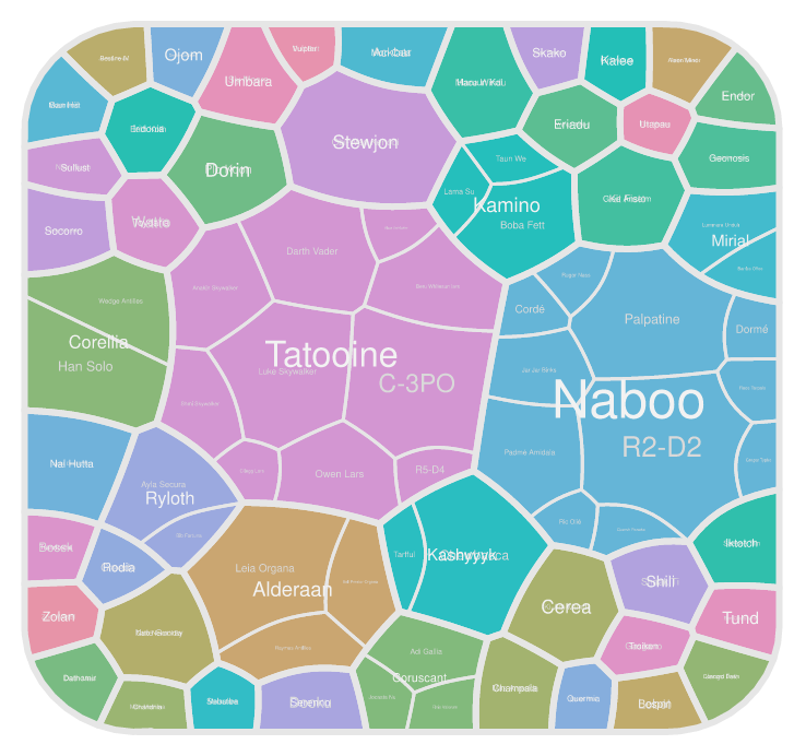
Create n-Dimensional, Quasi-Proportional Venn Diagrams
stoptags: venn,set
Visualisation of gene set over-representation enrichment analysis
stoptags: heatmap,bubble
star66
Interactive bubble plot to show different categories in seperate graph
stoptags: interactive,bubble
stoptags: boxplot,set
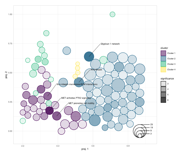
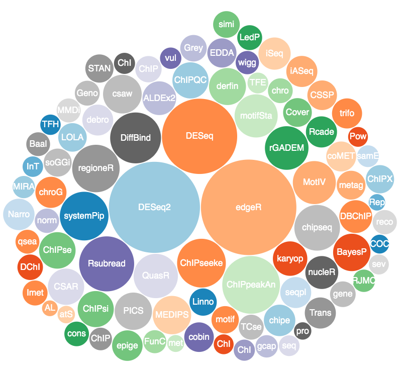
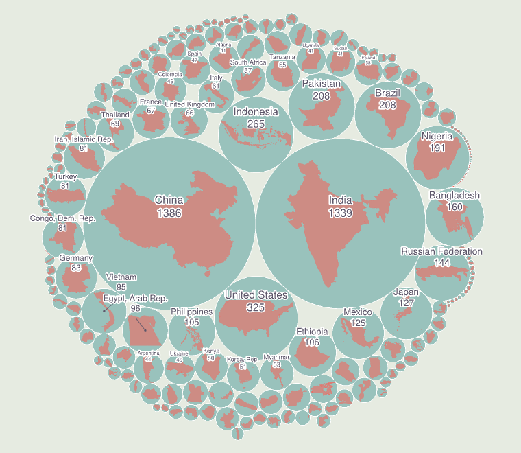
This one-function package computes circles with areas scaled to a variable and displays them using a compact layout
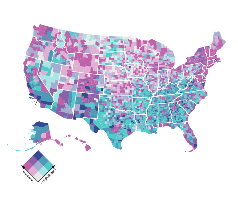
Bivariate Choropleth
stoptags: interactive,geograph
Animated racing barchart to show changes along time axis
stoptags: interactive,bar
star288
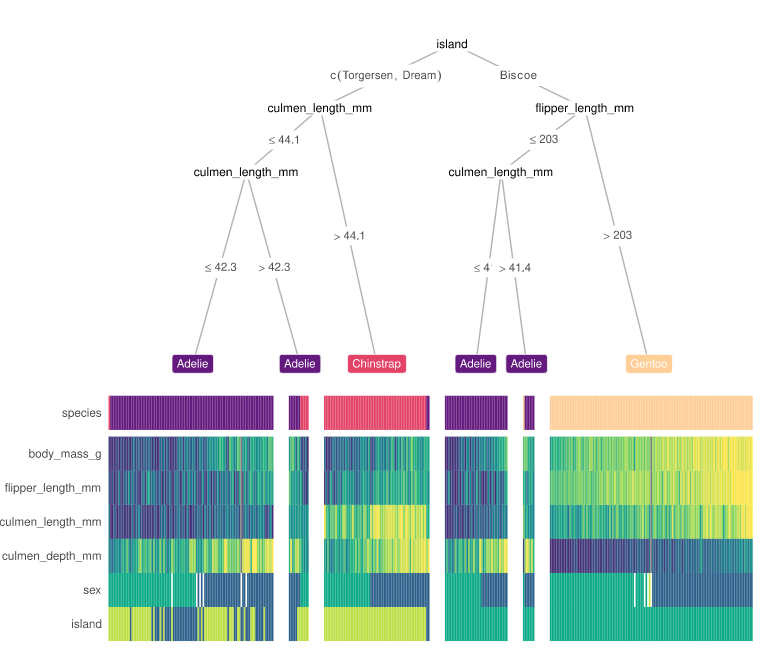
Displays a more interpretable decision tree visualization by integrating a heatmap at its terminal nodes
stoptags: tree,heatmap
star188
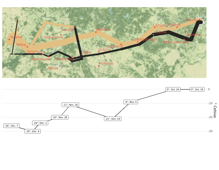
Exploring Minard's 1812 plot with ggplot2
stoptags: demo,history,geograph
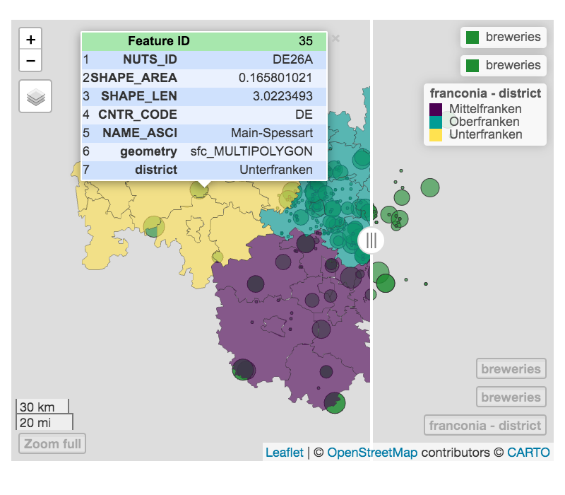
Provides functions to very quickly and conveniently create interactive visualisations of spatial data
stoptags: demo,bubble,geograph
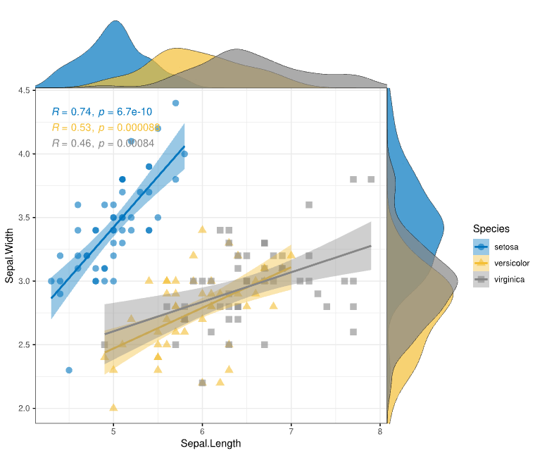
Show distribution of data and regression lines along with stats
stoptags: histogram,scatter
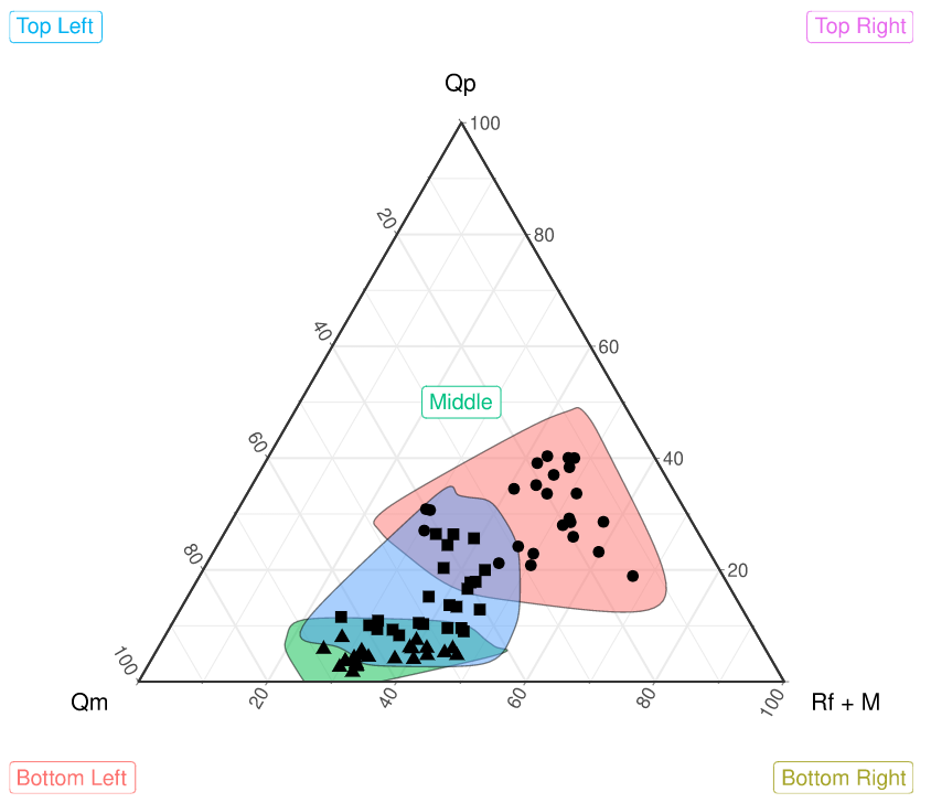
Ternary diagrams are Barycentric plots w/ three variables
stoptags: ternary